Crypto wallet
Crypto wallet
Crypto wallet
Spatium is a web3 wallet infrastructure provider advocating for open access to the blockchain ecosystem for everyone. They developed the technological stack that significantly facilitates web3 wallet creation.
I joined the team in 2022 as one of three designers. Here are some of the tasks I performed on this product:

Design system development
Design system development
Design system development
Introduction
& Scope
Introduction
& Scope
Introduction & Scope
The company already had a UI kit but lacked consistency and wasn't synced with the development team.
The task was to check the design for consistency, fully sync the design with development, update and describe components, and develop documentation for working with components.
Employees use the design system daily, which will be open-sourced later for companies to build their own crypto wallets.

Process
& Result
Process
& Result
Process & Result
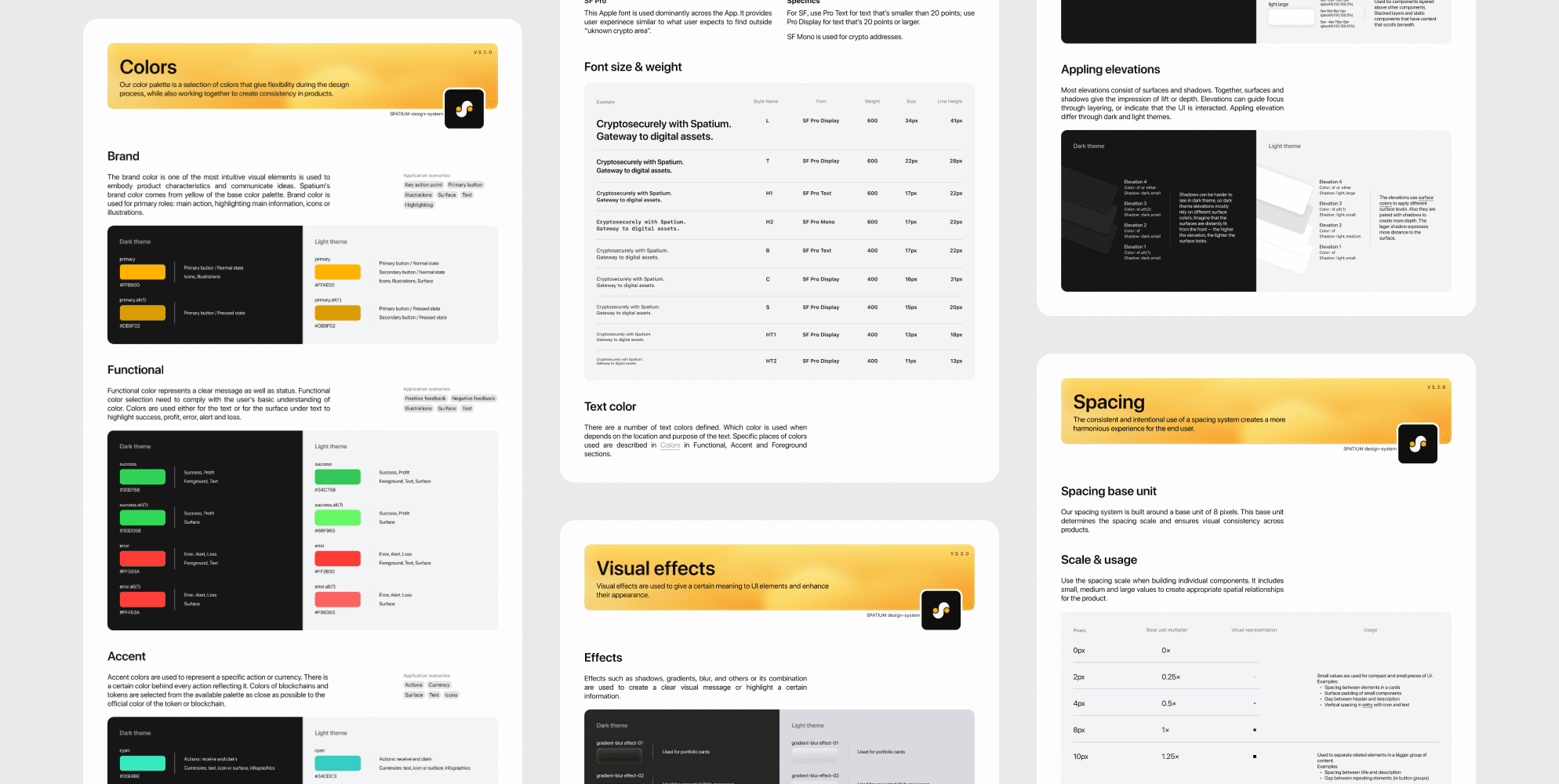
I conducted research through the best design systems to identify the most suitable organizing methods and patterns. As a result, the design system was divided into 3 parts:
Styles (Colors, Typography, Spacing, Elevation, Visual effects)
Assets (Iconography and Illustrations)
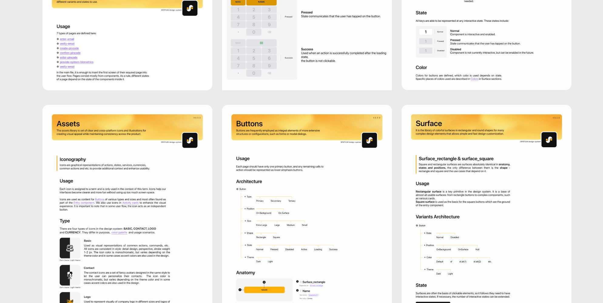
Components (Buttons, Inputs, Lists, Tags, Messages, Modals, etc.)
Some of the components were rebuilt or reorganized to meet development requirements. Also, I created documentation, including usage guidelines and design principles, to facilitate easy adoption and contribution by other designers and developers.
The design system contains 30+ components and 100+ variants. It is still in progress, and constantly being iterated on. There are some wins we've already achieved:
Less time spent on coding new components
Handoff is a lot more efficient (less explanation needed to describe elements)
Less back and forth during QA

Activity and portfolio cards overhaul
Activity and portfolio cards overhaul
Activity and portfolio cards overhaul
Introduction
& Scope
Introduction
& Scope
Introduction & Scope
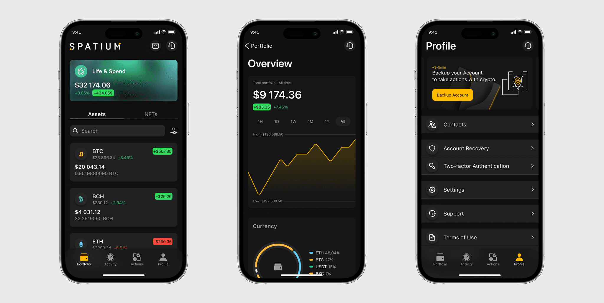
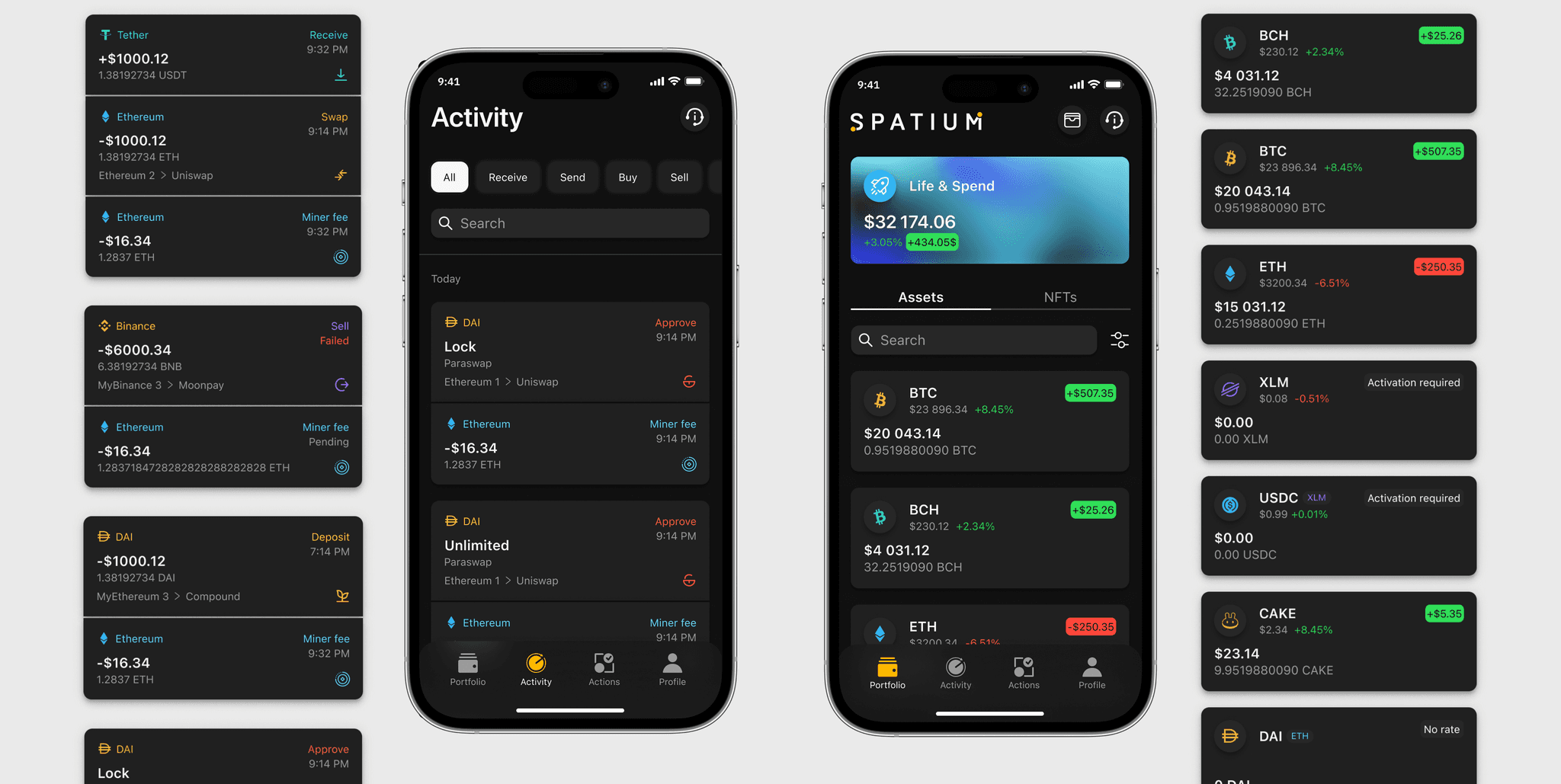
The main job of the app's activity screen is to monitor cryptocurrency transactions and wallet security updates. The portfolio screen shows the user's multi-currency wallets and cryptocurrency balances.
Before the redesign, each activity took 30% or even more of the screen. The general use of space was inefficient. In addition, the card contained almost all information about the activity. And, given that clicking opens full information about the activity, it makes sense to include only the main ones in the list. There was a similar set of questions for the cards on the portfolio screen.
Before

Process
& Result
Process
& Result
Process & Result
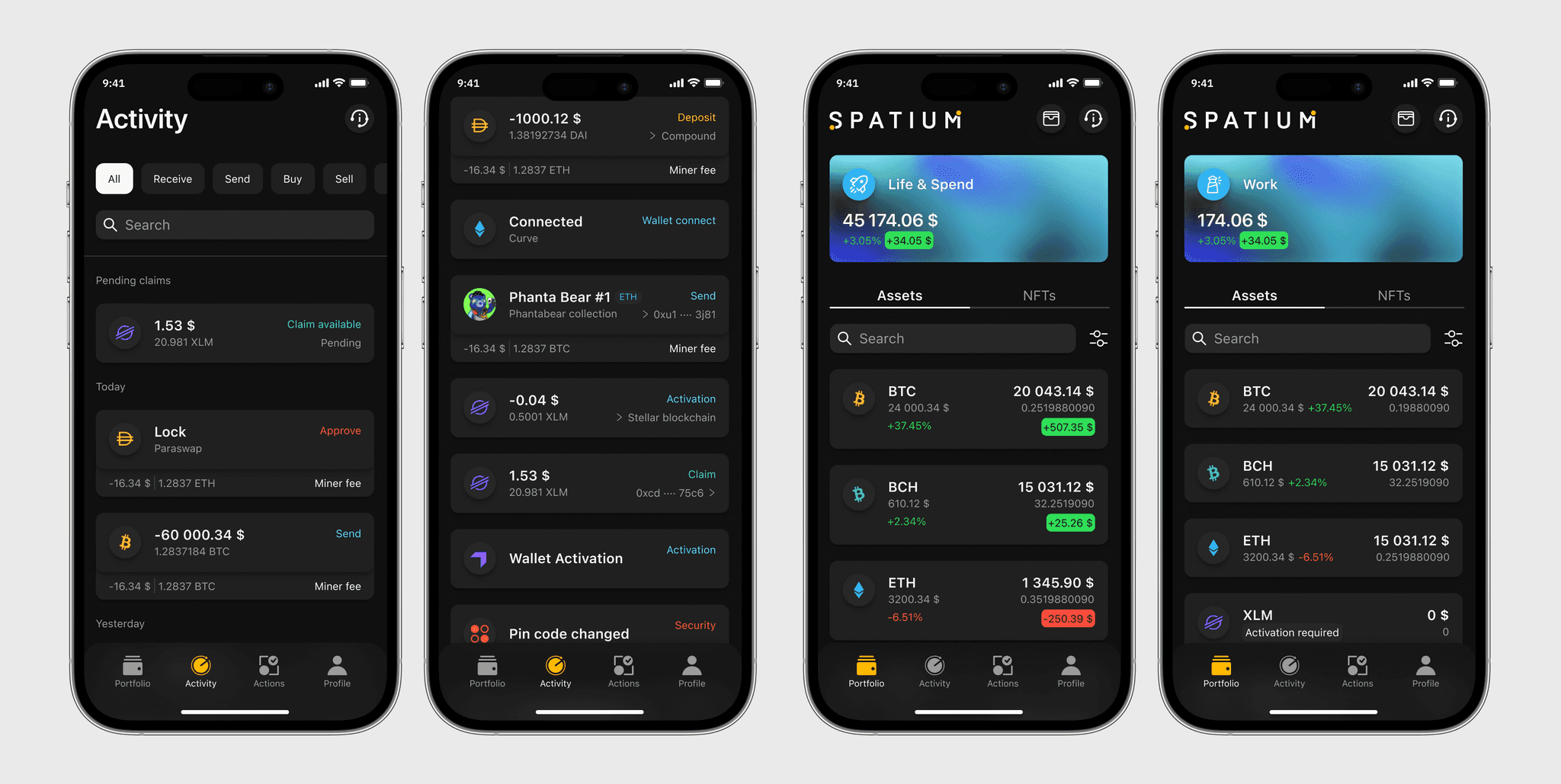
From there, we went to a series of interviews with users to understand the main jobs of the home screen. Having the research findings and hypothesis in place, I explored multiple options that we user-tested and iterated on.
As a result we:
Discovered that there is no need to display time on each card. So the list was just grouped by date
Defined the main operation in double and triple activities, others (miner fee, swap) were reduced
Left the color coding and names of different types of activities, but removed the icons
After our wallet was switched to multi-currency, only operation paths were left on the cards
Changed the portfolio cards' information architecture to optimize the use of space and make it more understandable
After

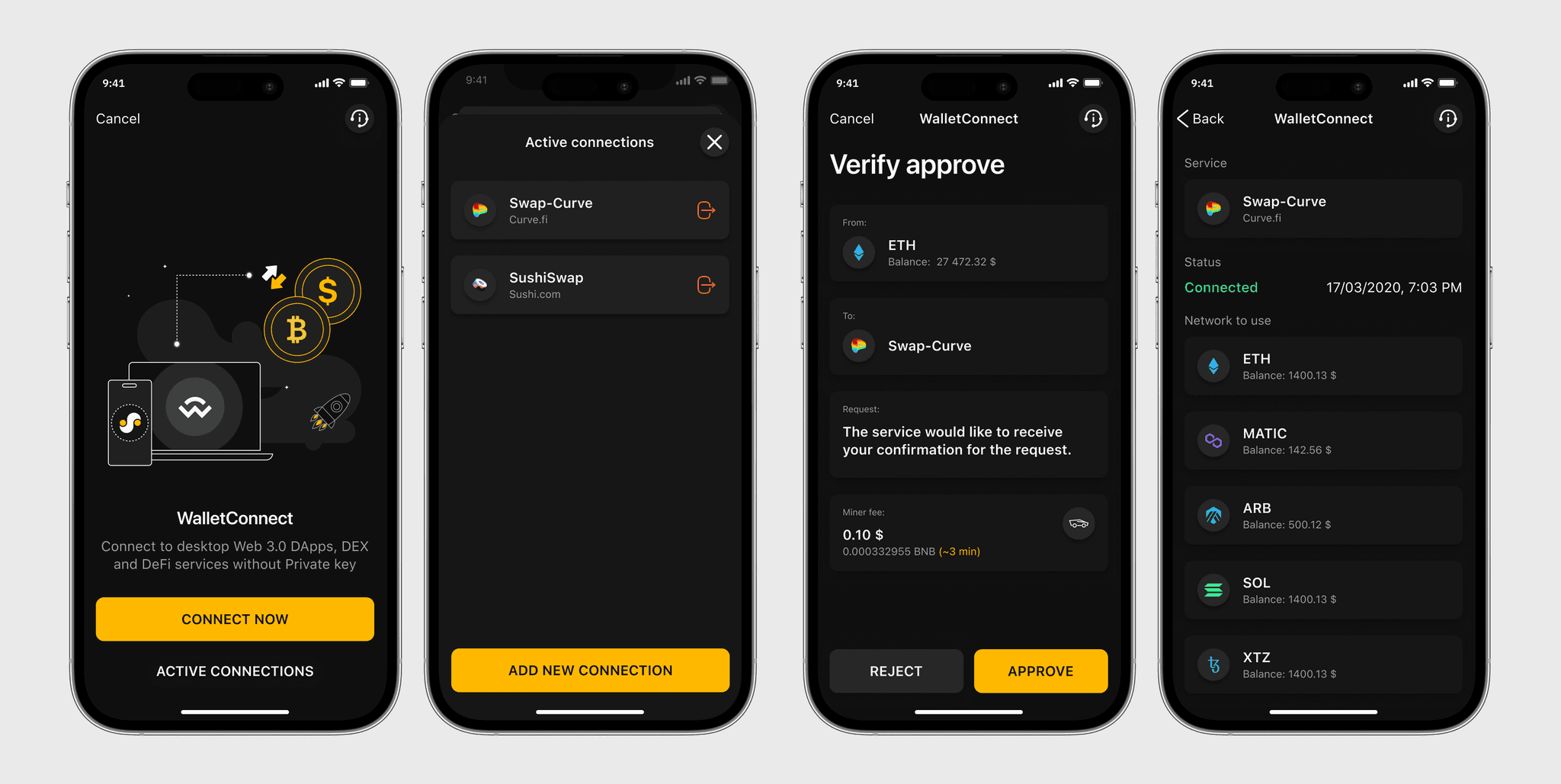
Wallet connect v2.0
Wallet connect v2.0
Wallet connect v2.0
Introduction
& Scope
Introduction
& Scope
Introduction & Scope
Wallet Connect is one of the app's functions. It has been developed in the application for quite some time and Wallet Connect v2.0 has been released.
My task was to research which changes were made, define and design the new user flow.
Wallet Connect is one of the app's functions. It has been developed in the application for quite some time and Wallet Connect v2.0 has been released.
My task was to research which changes were made, define and design the new user flow.
Before

Process
& Result
Process
& Result
Process & Result
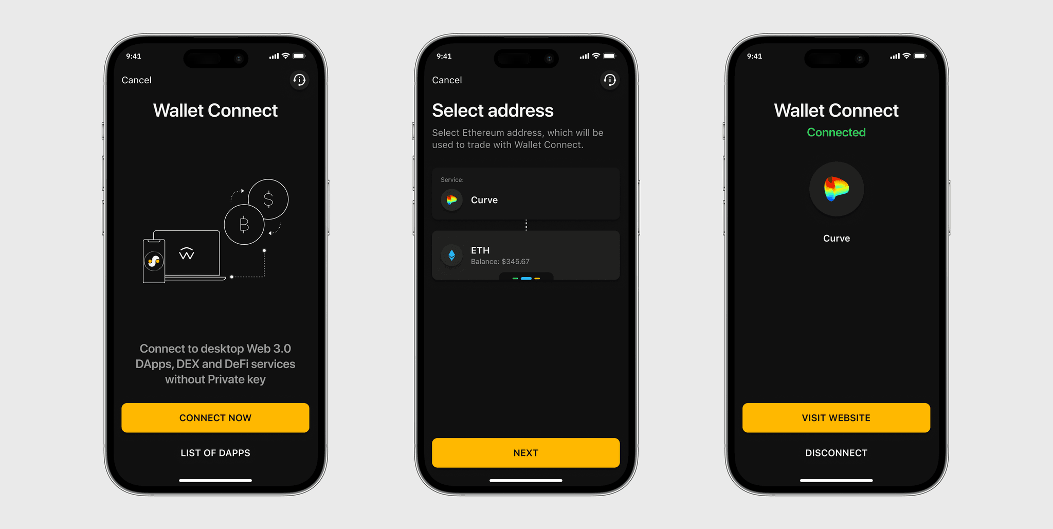
I conducted research on the changes introduced in Wallet Connect v2.0 compared to v1.0 and analyzed documentation. In collaboration with the project manager, we mapped out a new user flow highlighting the steps involved in connecting and interacting with external wallets. After that new screens were designed.
The result was a seamless transition from Wallet Connect v1.0 to v2.0 within the web3 wallet app, accompanied by a refreshed user experience and enhanced functionality. Today, when the feature is already out, Wallet Connect usage has increased by 25%
After
